The Minute UX™ series: one-minute reads about website problems I’ve discovered in numerous UX audits.
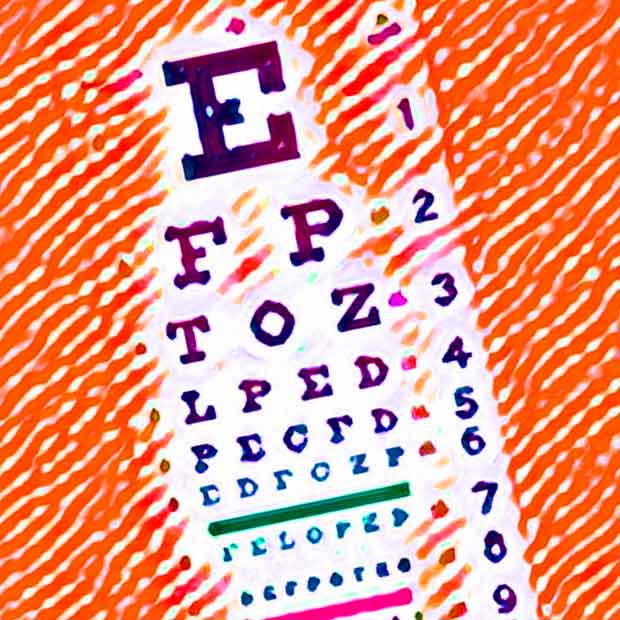
Website and email font sizes must be large enough for optimal readability and accessibility. The text you’re reading here is 18px (set in Roboto, a Google font). According to various sources,* fonts should be a minimum of about 16px. I often see fonts that are far too small, particularly on mobile screens and emails.
It’s important to adjust that 16px guideline based on the font. For example, in the examples below, Garamond appears smaller than Arial, and Montserrat appears larger. Accordingly, the minimum size for Garamond should be adjusted up to ~18px, while Montserrat may be adjusted down to ~14px.
16px
Arial
Lorem ipsum, quia dolor sit amet consectetur adipisci velit, sed quia non numquam eius modi tempora incidunt, ut labore et dolore mag.
18px
Garamond
Lorem ipsum, quia dolor sit amet consectetur adipisci velit, sed quia non numquam eius modi tempora incidunt, ut labore et dolore mag.
14px
Montserrat
Lorem ipsum, quia dolor sit amet consectetur adipisci velit, sed quia non numquam eius modi tempora incidunt, ut labore et dolore mag.
When it comes to readability, there’s much more to consider than just font size. When you have more than a minute, dig deeper in my post about common typographic issues.
Mobile and Email are often overlooked
It’s important to pay attention to font sizes on mobile devices (when poor responsive design sometimes reduces text sizes too much) and in emails sent using ESP platforms like Mailchimp, Constant Contact, HubSpot, etc. More than half of all emails are read on phones where it’s hard for users to adjust font sizes, since most mobile email apps don’t provide an easy way to enlarge text.
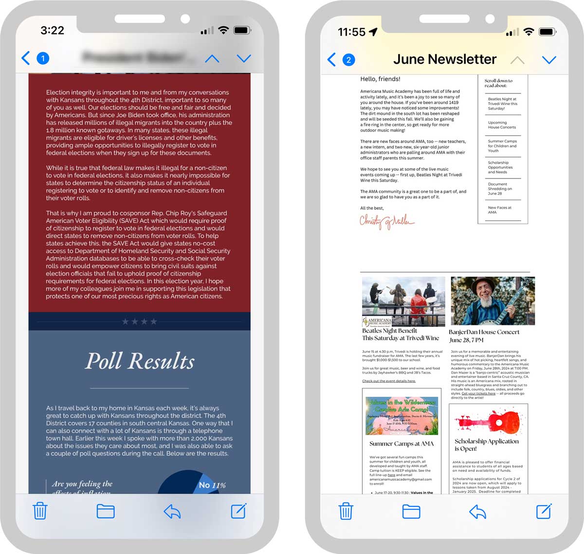
These example emails arrived in my inbox recently. Text is ridiculously small and nearly impossible to read on a phone, even with the phone flipped horizontally. Reverse-pinching to increase the size is awkward, especially when long line lengths go off the screen.
Deleting emails like this is much more likely than taking the time to find them on a desktop computer to read them there.
*References
Accessible Web: Minimum Font Size?
NN/g: Typography for Glanceable Reading: Bigger Is Better
Learn UI Design: The Responsive Website Font Size Guidelines