
The Minute UX™ series: one-minute reads about website problems I’ve discovered in numerous UX audits.
I suspect that website owners, designers, and developers view their sites more often on desktop screens than on phones and therefore mobile problems go unseen.
Every website will vary, but it’s not unlikely that the majority of your web visitors will be mobile. Global web traffic is 60% mobile, 2% tablet, 38% desktop (Statcounter ).
Responsive design is great, but it isn’t magic—it requires careful testing to ensure all is well. Issues I often see on mobile (when the corresponding desktop views look okay) include:
- Font sizes are too small (should be minimum ~16 px). (Accessible Web )
- Touch target sizes are too small (tap area should 0.4″ x 0.4″ minimum). (NN/g )
- Images are cropped poorly due to responsive resizing.
- Content appears upon mouseover (on desktop), which means it won’t be seen on phones or tablets (there’s no hover state on mobile devices).
- Graphics have embedded text that becomes too small on a phone screen.
These kinds of problems require effort to find and fix. My recommendation:
Be sure to perform diligent visual inspection and functional testing on mobile devices during development and every time content is added or updated.
Checking on your own phone is a good start, but not all phones and tablets act the same way. It’s best to test using a variety of mobile devices and browsers, both iOS and Android (or use a testing tool like BrowserStack ).
That’s a wrap for this Minute UX post!
Examples
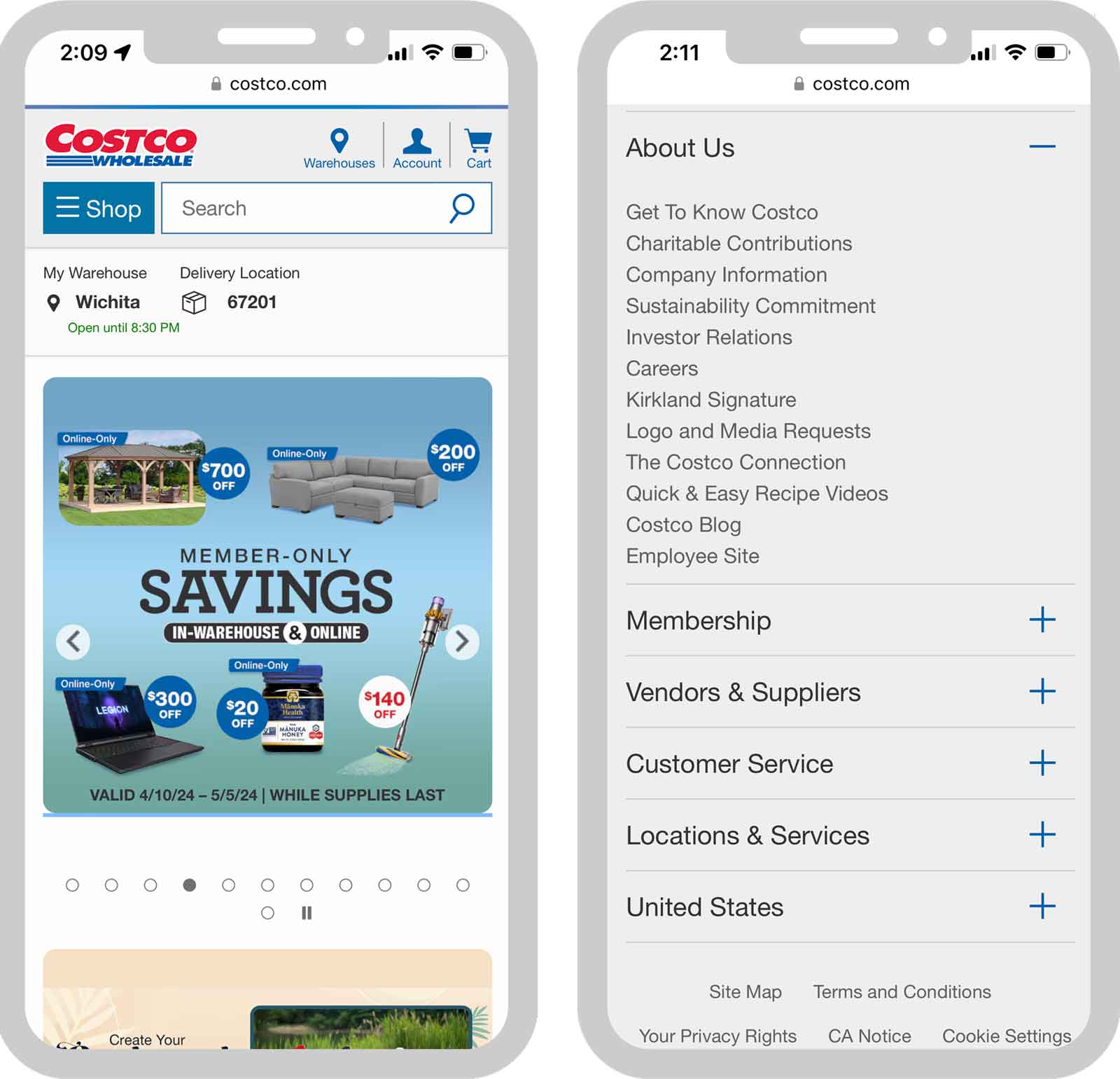
It’s so easy to find examples of the mobile usability problems noted above, even on major brand websites.
The left screenshot has text embedded in an image that becomes too small when it’s downsized for mobile.
The right one shows links on an expanded menu (under About Us) that are too close together to meet the recommended 0.4″ touch target.