
The Minute UX™ series: one-minute reads about website problems I’ve discovered in numerous UX audits.
Adequate contrast is required for text readability. That applies to everyone—especially as we age—but more particularly for people with various levels of vision loss.
For example, it’s difficult for most people to easily read this text.
But for some, this is hard to read as well.
WCAG provides guidelines for the contrast between text and background colors:
- Minimum 3:1 contrast ratio for text or images of text.
- 4.5:1 ratio for moderately low visual acuity and typical age-related contrast sensitivity common in adults around age 80. (This meets WCAG 2.1 Level AA which is a good standard for accessibility compliance.)
- 7:1 ratio (used for WCAG Level AAA) supports those with 20/80 vision without assistive technology.
When applying WCAG color contrast guidelines, “large” text is 18 pt. (14 pt. bold) or larger, and “normal” text is anything smaller.
How to check your website
To determine if your site complies, try this:
- Install the ColorZilla browser plugin in Chrome or Firefox (or something similar). Sample the desired text and the background to determine the hex color numbers.
- Open Colour Contrast Checker in another window and enter the hex numbers. (With ColorZilla, sampled colors will automatically copy to your clipboard so you simply paste them into Colour Contrast Checker.)
- If the contrast fails, adjust the sliders to achieve adequate contrast, then apply the new colors to your website.
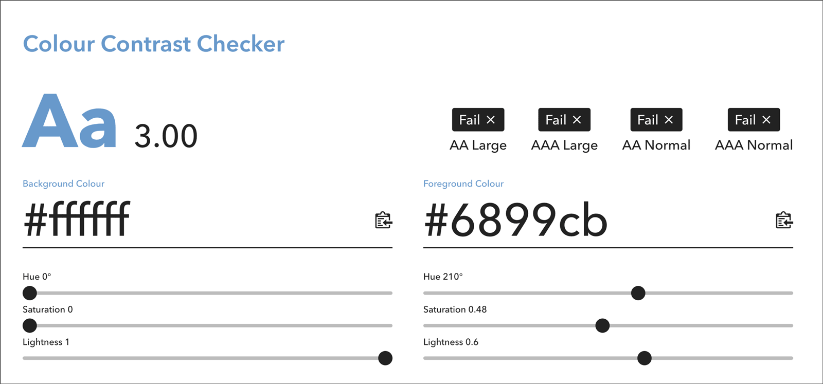
(Above) The blue text on a white background fails to meet AA and AAA color contrast guidelines.
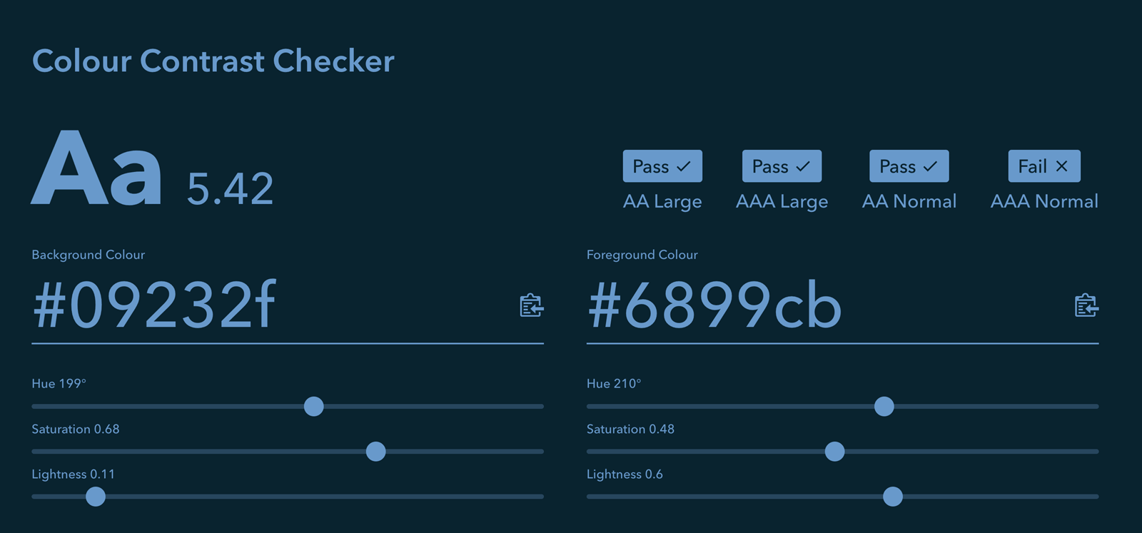
(Below) The same blue text on a dark background passes for levels AA and AAA large and level AA normal, but fails for level AAA normal.
Let’s work to make the web accessible to all!