The Minute UX™ series: one-minute reads about website problems I’ve discovered in numerous UX audits.
The most common mobile navigation problem is when a menu tab has two functions: (1) tapping the section title goes to a page, and (2) tapping an arrow or plus symbol opens submenu links. The problems with this are:
- If users tap the arrow or plus sign to open the submenu, they may miss content on the main section page because they don’t realize the section title is a link.
- Conversely, users may tap the section title and not discover the submenu links. Reducing discoverability of the submenu links is poor UX (and a disservice to website owners who want people to be easily find their content).
- If users tap somewhere between the section title and the arrow or plus symbol, where will they go? When people don’t know where they are going, that’s poor UX. (Some menus address this by placing a dividing line between the two target areas on the tab, which is better but by no means ideal).
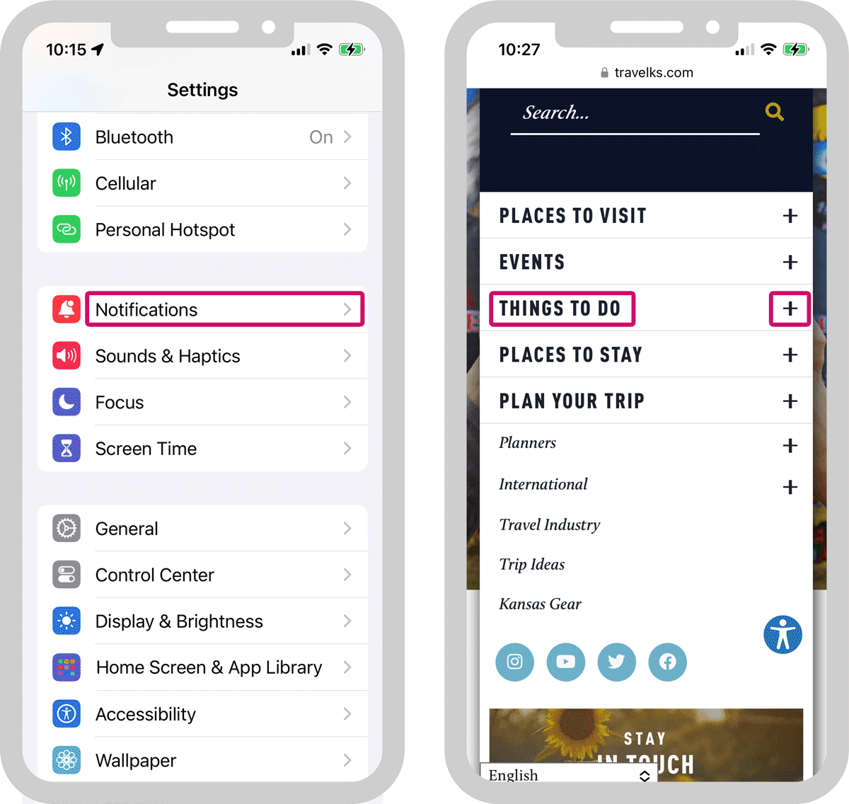
The iPhone UI (left) shows how mobile nav should work. No matter where you tap, the tab has one function (either to open a page or to open a submenu, but not both). People are trained to navigate mobile websites by device conventions and that makes this tap behavior intuitive.
The example on the right shows the problem I’ve described: the menu tabs have two functions: one to open a page (when the title is tapped), another to open a submenu (if an arrow or plus sign is tapped).
This problem is easily fixed: match the functionality of iPhone UI. In doing so, it’s also critical to place the main sectional page (in the example above right, the “Things To Do” main page) as the top link on the expanded submenu. Check out my in-depth post about this as well as some common desktop navigation issues that are parallel to this mobile nav problem.