
If you’re involved in the design or development of websites, or if you own or manage a site, I’m going to give you some free advice that is likely to apply to you. I say ‘likely’ because I’ve done dozens of UX heuristic audits (forensic analysis of a website’s usability) for a broad variety of clients. Each of them resulted in a surprisingly long list of usability issues and my recommendations to fix them. Notably, I’ve seen many of the same issues over and over, including the ones discussed in this post. It may be a bit deep into the UX woods for some of you, but I hope you’ll hang in there. I’ll start with my thesis:
- On desktop devices, website navigation menus should open on click rather than on hover.
- On mobile devices, the navigation tabs should not both link to a page and open sub-menus.
Of course, there are nuances and exceptions. But if in doubt, you can’t go wrong following those simple points. Allow me to explain why.
Desktop menus
People don’t always interact with menus the way you think they will. A simple navigation drop-down menu may not be so simple. Menus that open on hover can cause three main usability issues.
Issue #1: Once the menu opens, the user’s focus shifts to the menu content. When that happens, they will tend to select from the menu options. Because of that shift in focus, they may not realize that the top-level link (usually a section title) may not only open the menu but also link to a page. Consequently, important content may not be seen. That shift in focus is an even bigger problem on mega menus (which are increasingly popular) because they are so large they command even more user focus on the menu content and away from the link that opened it. To solve for this, follow the second diagram below. Open the menu on click (not on hover) and be sure the main section page is the first link on the expanded menu.
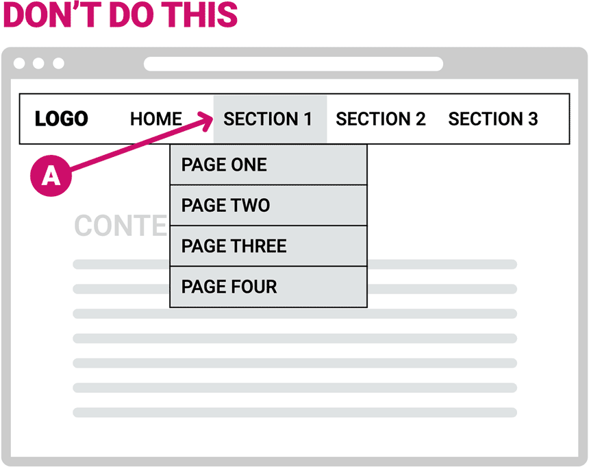
The top-level nav (A) should not open the menu on hover* and ALSO link to the section overview page on click.
*On very simple sites, opening the menu on hover may be ok as long as it doesn’t ALSO link to a page – more on that below.
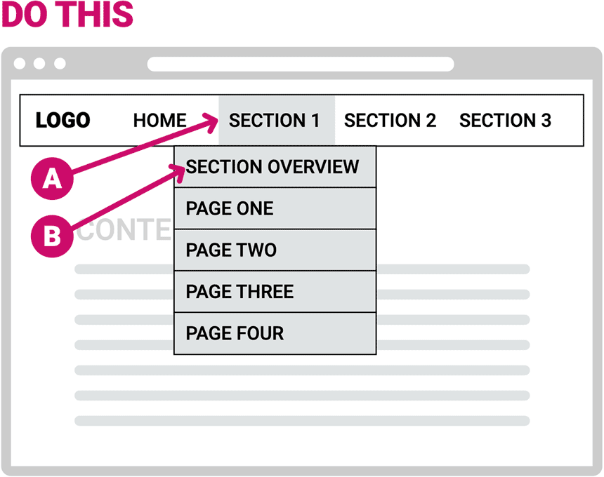
The top-level nav (A) should open the menu on click (and therefore not link to a page). The first item on the menu (B) should link to the section overview page.
This is important for simple menus like the one shown here, and even more so for mega menus.
Issue #2: The user loses control. A key UX principle is to help the user feel in control. An intentional click or tap lets them control the opening of the navigation menu. If the menu opens without the user intentionally initiating the action (if an inadvertent mouse-over opens a menu) they are not in control. Content that appears without the user’s intention violates W3C accessibility standards . These factors may not be a big problem on very simple websites with one row of main section links and simple drop-down menus (first example below). On such sites, arguably it’s ok to open the menu on hover because the act of hovering is a user-initiated action and users stay in control (even the NN/g website does this).
But loss of control can become a much bigger problem on sites that have two or three rows of navigation (sometimes each row having its own set of drop-down menus that open on hover). Check out the Pottery Barn website for example, where moving your mouse around the top of the page opens three levels of menus on hover which all get in the way of each other. This loss of control can be exacerbated with mega menus that open on hover (second example below), because the menus often take over most of the screen (which should not happen unintentionally).
Issue #3: There are problems on tablets. There are no hover states on mobile devices and therefore desktop design interactivity that’s triggered on mouse-over must be triggered with a tap on a tablet or phone. Depending on the responsive breakpoints, tablets will often display the desktop version of the navigation (especially in landscape orientation), rather than the mobile nav. In that case, desktop menus that open on hover must be tapped to open on a tablet. If the desktop nav design has a section title that opens the menu on hover and links to a page on click, then on a tablet the first tap opens the menu and the second tap on the same section title goes to a page. That’s not very intuitive for many users. The first tap that opens the menu naturally focuses the user’s attention on the menu content and not the tab they just tapped, thus bringing us back to problem number one above.
Mobile Menus
Problems with mobile navigation often correspond with those described above for desktop designs. That’s not surprising since with a typical CMS the site architecture determines the menu content, and the styling applies that structure to both the desktop and mobile navigation. The responsive design coding automatically swaps the desktop navigation design for a mobile version when the screen size reduces to a predetermined size. (The mobile nav is usually hidden and exposed by tapping a hamburger icon.) Accordingly, problems with the desktop navigation design often translate to problems with the mobile nav. (But not always—sometimes one has problems and not the other.)
With that in mind, I often see problems on mobile navigation design that corresponds to problem number one described above for desktop nav.
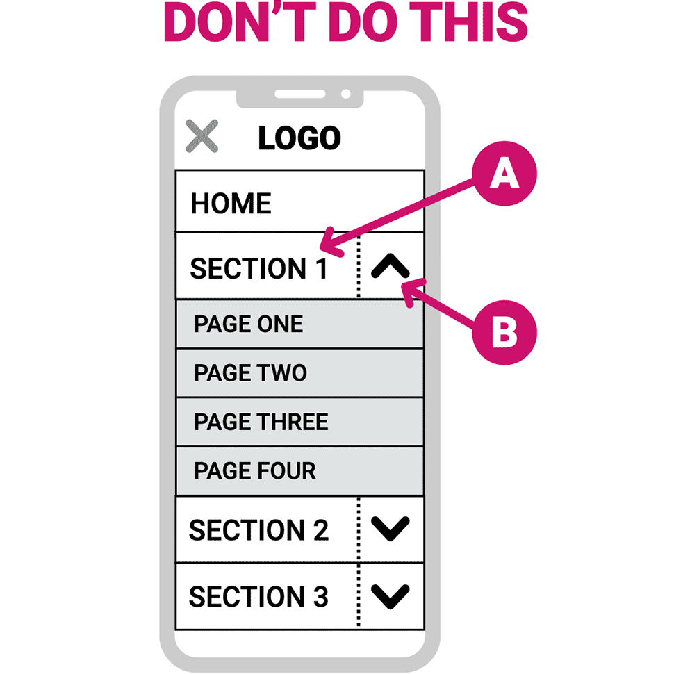
This diagram illustrates the problem. The section titles (A) tap to a page (typically the section overview or introduction) and on the right side of the same tab (B) an arrow toggles the sub-menu tabs open and closed.
There are several problems with this:
First, users may not notice (or understand) the dual functionality. As a result, they may expand the sub-menu with the arrow (the arrow being an inviting CTA) and, just as with problem number one on desktop nav, as their attention shifts to the expanded menu they may completely miss seeing important content on the section’s top-level page.
Conversely, users may tap the section title and not discover the submenu links. Reducing discoverability of the submenu links is poor UX (and a disservice to website owners who want people to be easily find their content).
Lastly, the target area of the arrow that opens the sub-menu is often small and hard to tap, or the (often invisible) division between the target areas of the section header and menu expansion arrow is unclear. This may result in the user’s intention to open the sub-menu resulting in navigation to a page instead, or the opposite, it may result in the intention to go to the page opening the sub-menu.
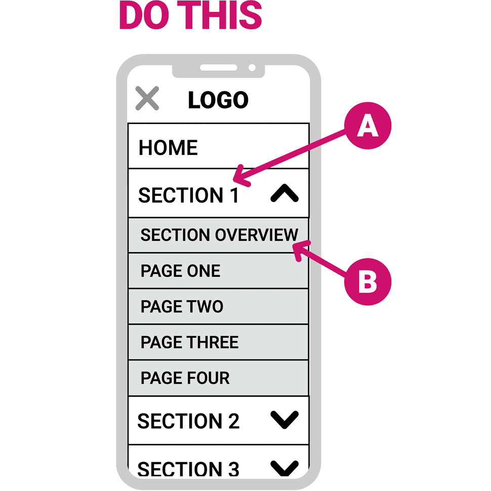
Fortunately, as with desktop nav, there’s a simple solution (shown in this diagram).
Ensure that the section title tab (A) has only one function: to open and close the sub-menu, or to go to a page (if there is no sub-menu). If there is a sub-menu, be sure the section overview page (B) is the first page listed. This solves the problems I described by applying many UX design principles in one fell swoop: user control, error avoidance, clear mental mapping and forcing function.
I encourage you to take a look at any website that you’ve built, own or manage and see how the menus function. If the desktop menus open on hover and/or if the mobile menu tabs have dual functionality, consider making the improvements proposed in this post. All your important content will be clearly accessible, and users will thank you.