
There’s a reason “don’t reinvent the wheel” is truth. Despite many centuries of science, technology and innovation, mankind just hasn’t come up with anything that works better than a wheel. In web design there are also things that shouldn’t be reinvented.
In a recent user testing study, I observed a few common themes that I’ve heard many times before. In an effort to be creative and innovative, designers sometimes ignore UX fundamentals and as a result cause problems for users. Don’t get me wrong, I love creativity and innovation. But when designers choose to break with convention they are taking risks that must be carefully considered. This NNG video, especially the portions about external consistency heuristics, is a good primer.
I’ll touch on three areas where I believe convention should trump innovation. This advice is based on one of the fundamental principles of human-centered design: make things intuitive.
1. Put user account access in the upper right
When people want to log in to their accounts, they immediately look in the upper right corner of a web page (like the illustration below). After they are logged in, they look in the upper right for links or navigation to manage their account or log out. Don’t frustrate them by making them hunt elsewhere.
2. Put contact information in the footer
Put a link to the contact page in the footer. When appropriate, show the phone, email and other contact info right in the footer. It’s where people immediately look to find it. Other links that users often expect to find in the footer are FAQs and careers. Even if those links appear in the navigation at the top of the site, they should also be in the footer. Sometimes it’s even helpful to have links to all the main site sections in the footer. You’d be surprised how often people look in the footer to find what they need if the navigation at the top of the site is not doing it for them.
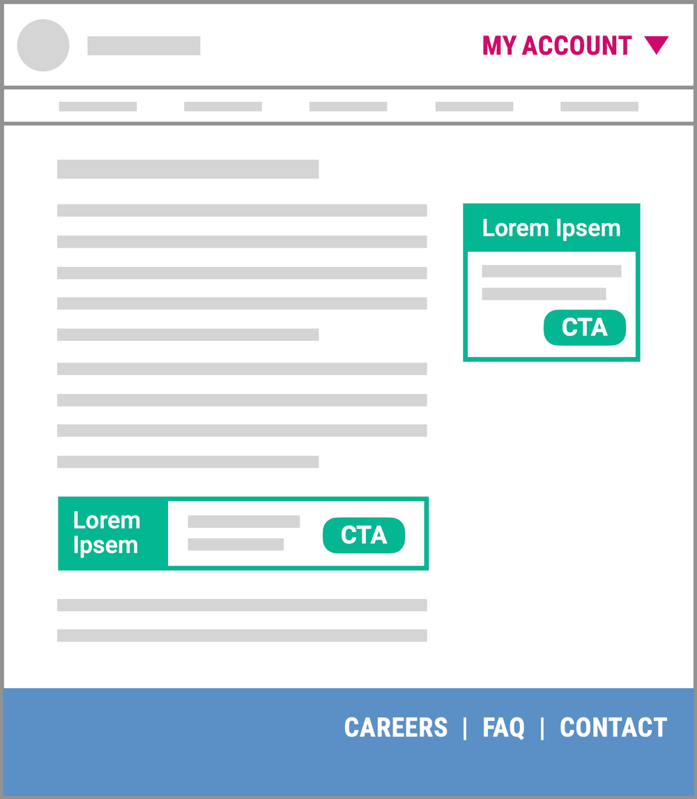
3. Don’t make content that looks like ads
Surprise! People don’t click on ads. The average display ad CTR is less than one-half of one percent. And that’s people who see the ads, since 27% of Americans use ad blockers. But you know what else? People mentally block ads also — they just don’t see them even if they look at them. If you have important content on your website that you want people to see, don’t design it in a way that resembles an ad (like the green rectangles on the web page illustration above).
Be creative with the content, not the User interface
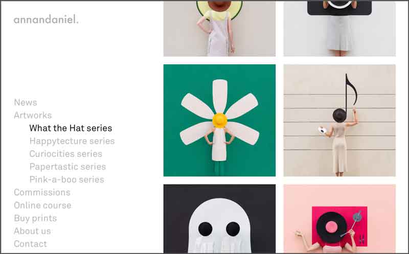
There’s no lack of opportunity for innovation and creativity just because you subscribe to norms in UI design. Saying otherwise would be like saying a car design can’t be exciting, inspiring or fun unless it doesn’t have round wheels. I love this example of a simple UI with creative content that makes me smile. Hope you enjoy!