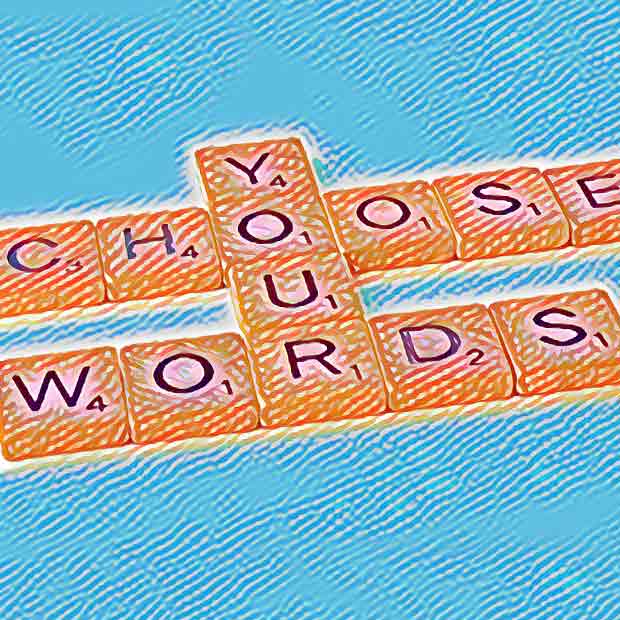
In UX, using the right words to label things means the difference between success and failure. The wrong label can create user frustration that can hurt a business. Words matter — and sometimes the simplest words are the hardest.
Recently, I was working with a client on a website update. During a Zoom meeting with the two company principals we were discussing a new Approach page. The page was important because both of them were passionate about the content’s fundamental value to their audience, and as such, Approach would probably be the name of a link in the site’s main navigation. As the meeting went on, I realized that they seemed to be far apart about what the content of the Approach page should be. It turned out that their perception of the content was influenced by their different interpretations of the word “approach.”
One of them was thinking of approach as the company’s process, while the other was thinking of it as the company’s philosophy. The confusion that ensued was eventually resolved by agreement between them that the Approach page should be the company’s philosophy and that another page could be created to present the company’s process.
This got me thinking about users of the site, who are not privy to any discussion or explanation of what they should expect to find when they click a link labeled Approach. It’s the UX designer’s job to ensure that the right taxonomy (the science of categorizing, naming and grouping) is used so people get what they expect when they click a link, or they find what they want when they are scanning a page for options.
According to NN/g, “Obscure category names often increase the interaction cost because they force people to guess (often wrongly) what the labels refer to. Also, websites with poor labels cause users to make choices that don’t match their goals…”
To confirm that users won’t be confused by Approach as the label for a page that essentially contains a company’s philosophy, I did a quick Google Survey. I asked:
Q: When a business talks about its “approach” it is mainly referring to:
• Its “philosophy”
• Its “process”
I targeted the survey to adults in the U.S., age 25-64 and set it to randomly rotate the two answer choices to avoid any bias that could come from the order in which they were presented.
Accounting for a statistical margin of error, the results were about a 50/50 split:

I looked a little deeper and sorted the results to reflect the primary target audience of this company’s marketing efforts. That skewed the results even more toward “process” being the winner (although with only 39 respondents in that segment, the statistical validity is significantly reduced):

It seems clear from this exercise that the initial agreement to call the page “Approach” was the wrong one and that “Philosophy” (or another word that clearly communicated philosophy) would be a label name for the page.
Ultimately, as with most questions like this, the best way to resolve any potential confusion is through user testing. The beauty of the Google Survey was that is was a very fast (1 day) and inexpensive ($20 for 150 responses) way to see past any potential personal bias of either the client or myself as the UX designer. And it highlighted the importance of further exploring any potential confusion with users via user testing.