I was recently hired to do a UX audit of a newly redesigned e-commerce website. The business experienced a surprising decline in sales after the redesign. (To be clear, I wasn’t involved in that redesign.) My audit turned up dozens of user experience issues that I believe were contributing to the sales decline. I can’t share the company or website details because of client confidentiality, but I can demonstrate the importance of a UX audit using a couple well-known brands as examples. Specifically, I’ll show a few UX issues that I discovered during my own experiences with the Whole Foods (Amazon) and Dillon’s (Kroger) grocery shopping apps.
What is a UX audit?
Before getting into those examples, what exactly is a UX audit (sometimes called a heuristic evaluation)? It’s a review of a website or app by an expert who’s been trained to see things not from his or her own perspective, but rather from the user’s perspective. The auditor should be someone who understands how to apply UX best practices to meet users’ needs. While it’s normally best to employ actual users and conduct formal user testing, a heuristic evaluation can be the next best thing. And a UX audit has the added benefit of being much faster and less expensive than formal user testing.
When performing a UX audit, I rely on a broad range of similar experience with other sites or apps as well as training and experience in UX best practices. I also draw observations from competitive websites or apps similar to the one being evaluated. Relying on the NN/g usability heuristics and the Laws of UX, with the client’s business goals in mind, I evaluate the site’s usability, site structure, navigation, user interface design, content, interactions, etc. — all from the user’s perspective.
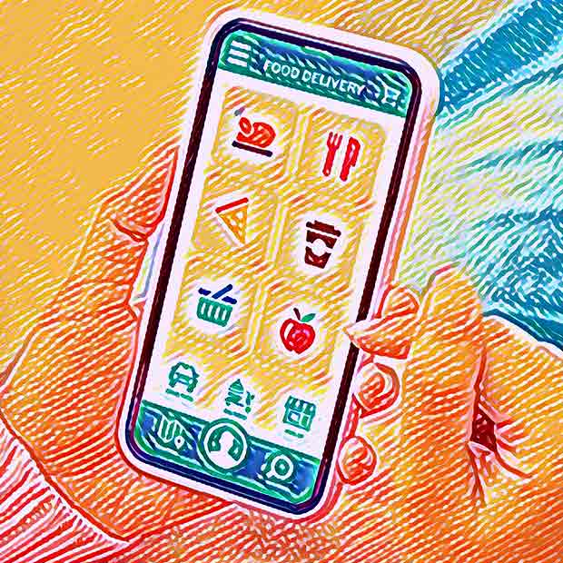
Whole Foods (Amazon) vs. Dillon’s (Kroger) Mobile Apps
The examples that follow are from my informal UX observations of the Whole Foods and Dillon’s mobile grocery shopping experiences.
The first is thing Whole Foods can learn from Dillon’s is allowing the user to scan bar codes to place items in the shopping cart. It’s particularly frustrating that Whole Foods doesn’t have this feature, especially considering that the Whole Foods shopping experience is inside the Amazon app, which does allow you to scan barcodes to add items to your Amazon cart.


This is a no brainer. What gives, Amazon? It doesn’t seem likely that Amazon is unaware of this issue, so there may be some technical challenge that’s much larger to solve than one would assume at first glance. But is that really an excuse for a multi-billion-dollar business like Amazon?
Points to Dillon’s/Kroger for much better UX in the scan-to-list category.
the pick-up-your-order experience
The next feature where Whole Foods falls a bit short is the name of the button used to tell the store that you’ll be picking up your groceries soon. Perhaps you’ve heard the story of the $300 million button. This one isn’t that dramatic, but it’s the same kind of problem.

On the Dillon’s app, when your grocery order is ready, they text you and ask that you let them know when you’re coming so they can have the order ready to place in your vehicle. A link in that text that takes you to the app screen shown here.
It’s a beautifully simple process. There’s a button that says, “I’m on my way” and a second button that says, “I’m here.” After tapping “I’m here” you’re prompted to enter your parking spot (1-10) so they know where to bring your order. So simple and intuitive, no thinking required.
With the Amazon/Whole Foods app it’s a different story. The intent is the same, but the button says, “Check In.”
The name on that button requires thinking. My natural instinct when I see a button labeled “Check In” is that I would do it when I arrive at the store. However, when you read the explanatory text, it’s clear that you’re supposed to “Check In” before you leave for the store. Understanding what to do can only be determined by reading the instructions, which is always a watch-out because people often don’t read instructions. Why not just make the button text intuitive like the Dillon’s app?

Points once again to Dillon’s in the pick-up-your-order experience category.
These are just a few simple examples of how a UX audit can uncover opportunities to optimize a site from the user’s perspective, improving sales and enhancing brand image in the process. User frustrations always equal withdrawals from the brand satisfaction emotional bank account. And often many user frustrations can be prevented with simple, inexpensive updates like the name of a button.
If you’d like a UX audit of your website or app, give me a shout and let’s talk!