Carousels are ubiquitous on websites, but they present unique design challenges. First, most people scroll right past them without seeing anything but the first image in the series. That can leave important content unseen. Second, while they often look great on desktop screens, they don’t always translate well to mobile. Since mobile represents the majority of traffic for most websites, that’s a problem. I love huge panoramic photos as much as many designers seem to. But we need to remember that most people view websites on 3-inch rather than 30-inch screens.
Nielsen Norman Group has a good article that examines the pitfalls of carousels and offers some good guidance. They warn that “…on large or small viewports, people often scroll past carousels,” and recommend using static hero images rather than carousels.
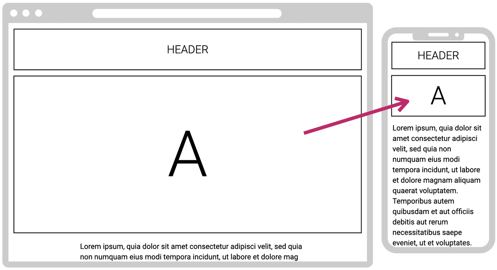
I agree with that advice. But a single static hero image needs to be effective on both desktop and mobile, which also presents challenges. I sometimes see heroes that look great on desktop but when kept in the same aspect ratio on mobile, they become too small and lose their dramatic appeal (like the example here). In a case like this, the image can be cropped on mobile to make it more portrait, but many images can’t withstand that treatment without losing important content.
One way to solve for this is to use multiple images in the hero area as shown below. The beauty of this layout is that it works well on both desktop and mobile. The images don’t need to be cropped to look good on mobile — they can maintain their aspect ratio. That’s particularly helpful when the blocks are essentially small “ad units” that include text and CTAs.
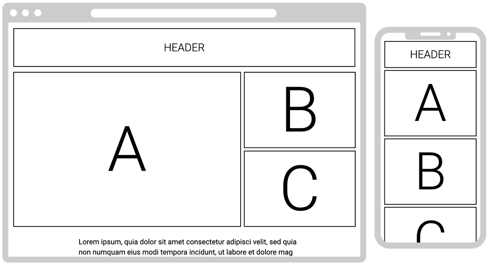
They stack nicely when the responsive design rearranges the blocks vertically for mobile devices. If there are stakeholder political challenges about who gets to have the A position, the placement of A, B and C can be randomized so each gets equal exposure over time.
When carousels are unavoidable
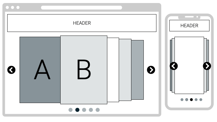
Sometimes, carousels are desired to ensure that important content appears in the prime screen real estate area on the top of the home page (or other key site pages). As mentioned, I believe that multiple content priorities can be handled with static images. However, if a carousel is unavoidable, the NNG article advises (in part):
- Include 5 or fewer frames (personally, I like the “power of three“).
- Indicate how many frames are present and where the user is within the progression, to help people feel in control.
- Ensure that navigation controls appear inside the carousel, not below it or separated by a fold.
- Make links and buttons large enough to decipher and click.
- To the NNG list, I’ll add one of my own: be sure the design works equally well on desktop and mobile devices.
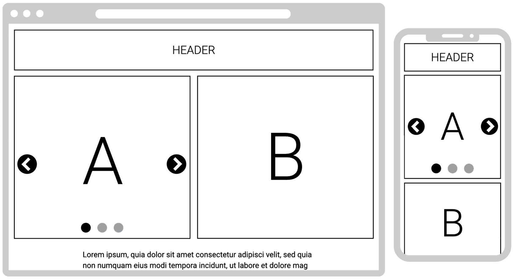
A design approach that I like is a combination of a static hero image and a mobile-friendly carousel, like the mock-up here.
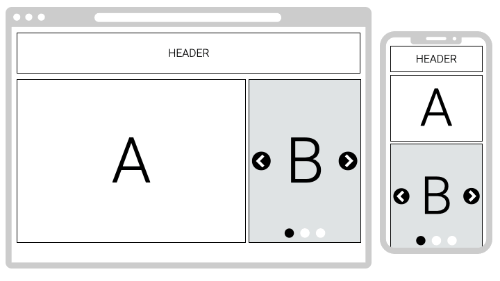
The beauty of this concept is that the translation to mobile is much more effective than the standard desktop hero carousel (where the aspect ratio of a horizontal image doesn’t work well on mobile).
This concept can also work with the A side as the carousel and the B side as a static image. The more vertical the images the better for mobile, so the A space should be square or slightly vertical.
You can get creative in many ways, just remember to follow the five-point checklist above.
I hope these ideas help you improve your website hero images — and carousels, too…if you must :).