
According to Smart Insights, the average click-through rate (CTR) for online display ads is about 0.1% (one click for every 1,000 ad impressions). That’s an average and in practice CTRs vary widely depending on the size and type of ad, the industry, the audience targeting, the media outlet, and other factors. The CTR for social media ads is much better than online display ads. And of course, the cost of one of those clicks varies widely as well. But one thing is certain: with the low CTR and/or the high CPC (cost per click) of digital ads, it’s critical to make every click count. Converting those clicks into business results is the goal. It’s all about return on investment. And that’s where UX plays an indispensable but often overlooked role.
With clicks being so precious, you would think agencies and marketers would work harder to improve ad effectiveness. But I see so many obvious UX problems with online ads that, if fixed, would undoubtedly improve the business results. It’s all about converting one of those rare or expensive clicks into a desired action.
Good UX design is not just for websites and apps. In the digital marketing context, it’s for every human-computer interaction (HCI) that moves people through a marketing funnel, from first contact to ultimate conversion. In addition to websites and apps, that includes online ads, email, SEM, social media, text/IM, gaming, smart devices, etc. (Great UX should also apply beyond screens to interactions IRL like shopping experiences at brick-and-mortar stores, packaging, phone conversations with customer service representatives, etc.). Too often in my experience agencies and marketers relegate UX to websites and apps and completely leave it out of the process of designing and producing all those other types of marketing communications.
Context is critical
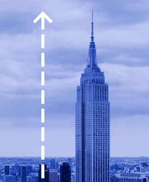
Think of the context in which digital ads live. According to Kunal Gupta, “The average social media user scrolls the height of the Empire State building every day.” Just watch someone scroll through a social media feed (or be self-aware as you do it yourself). The posts, stories and ads fly by at lighting speed. Gupta says users spend “an average of 1.7 seconds on each social media ad.” That’s the average. So as an example, for an ad lucky enough to hold someone’s attention for 3 seconds, the next ad in the feed gets about half a second.
Think of that context and envision a digital ad that takes the form of a 15-second mini motion picture (like the first example below).
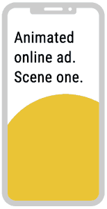
In a case like this, the story line that can only be understood by watching the ad from the beginning all the way to the end. Note also in this example that the advertiser’s name and the CTA appear only at the end of the story line. That kind of ad may be ok on traditional television or on YouTube, but it’s all wrong for most other digital ad environments. By the time the story has been told and the CTA appears, users have scrolled far past it in their feed. This applies to mobile and desktop, social and online display.
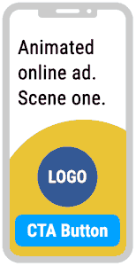
A slightly better version of such an ad (one that’s a movie wannabe) is illustrated here. The mini motion picture can play along in hopes of grabbing someone’s attention and telling a story, but the advertiser’s brand name and the CTA are persistent the entire time. In that way at least a brand impression is made, and users are given the encouragement via a CTA to click at any point they may be inclined to do so.
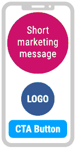
The best type of animated ad IMO is represented by this third example. (Hopefully it’s obvious but perhaps I should say that these three examples are not intended to illustrate good visual design — strictly the information flow and user experience.) The animation is used not to tell a story, but rather to attract attention or pique interest. The ad message should be relevant, compelling, and persistent — it should not be revealed along a story line like a movie. The advertiser’s brand and the CTA should also be persistent and not wait to be revealed after some animation has transpired.
Attention is an exceptionally precious commodity
One of the best quotes I’ve read recently is from Christopher Butler:
A good piece of information design should communicate the most truth even when given the least amount of attention.
No matter what kind of information you’re working with, what kind of person you’re trying to communicate to, or what kind of result you’re hoping for, there is just one factor that will determine the outcome: attention. And if there’s one thing that most designers have in common, it’s that they assume that what they create will get much more of it than is realistic. [My emphasis]
I believe the idea of not assuming more attention than is realistic should inform ALL commercial design, and especially the design of marketing communications and websites. The assumption that our content commands attention better than it does is a fundamental mistake in UX design. As one case in point, research has proven that people generally don’t read web pages (NNG), they quickly scan them. (That’s why keeping web copy brief is so important as I explain in this article.)
With attention so scarce, how can UX design help ad conversion?
When you actually get one of those rare ad clicks you want to do everything in your power to make sure it leads to a conversion of some kind — right? Well, looking at the user experience of a lot of online ads, you’d wonder if anyone is thinking about that aspect of the equation.
In UX design, a user flow diagram illustrates the user’s path to finish a specific purpose. In the case of a digital ad, that flow is typically simple and may look something like this:
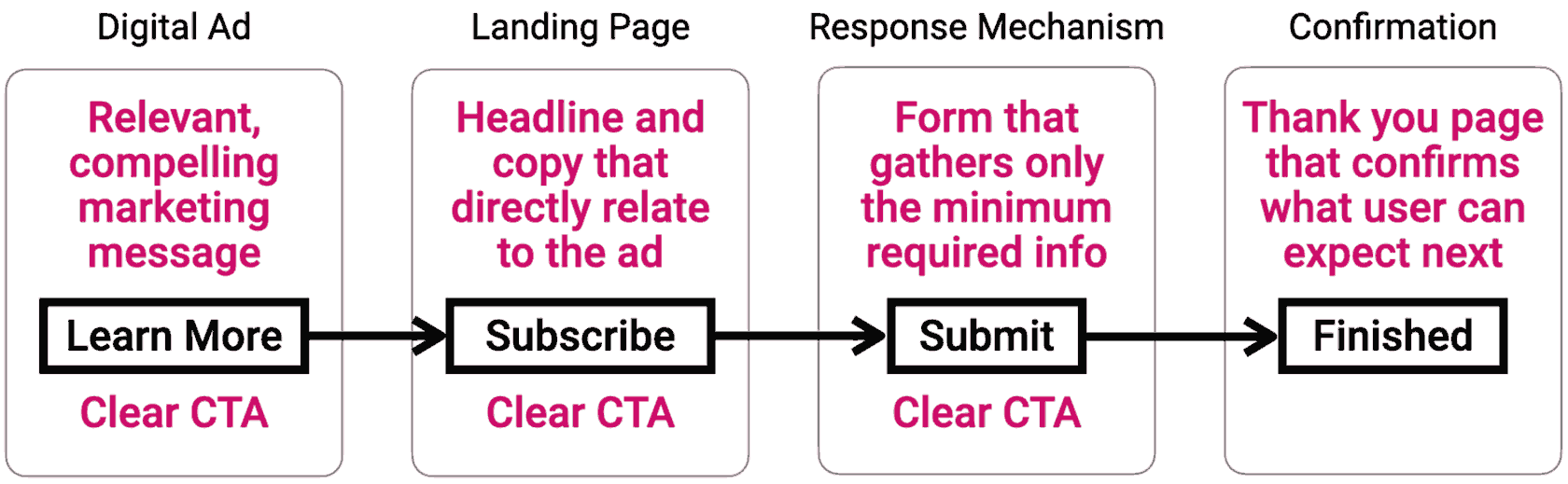
Note how the landing page headline directly pays off the content of the ad. A common mistake is assuming a higher degree focus to “connect the dots” along the series of messages as users click from the ad to the landing page to the conversion action. (“Don’t Make Me Think” is a fundamental UX tenet and the title of a book by Steve Krug that every designer and marketer should read.) This typically works best when the landing page is written and designed specifically as part of the ad campaign.
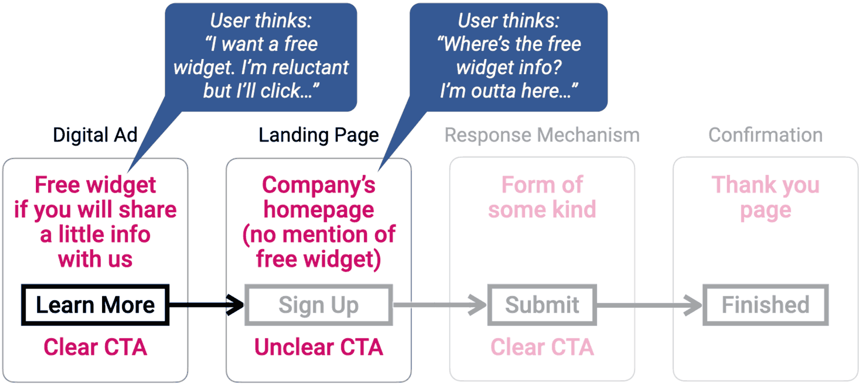
It’s not uncommon for an ad to click to the homepage of the advertiser’s website where the ad message is not paid off directly. If that happens the user if left to search for something related to what the ad said (which most people won’t — they will just leave):
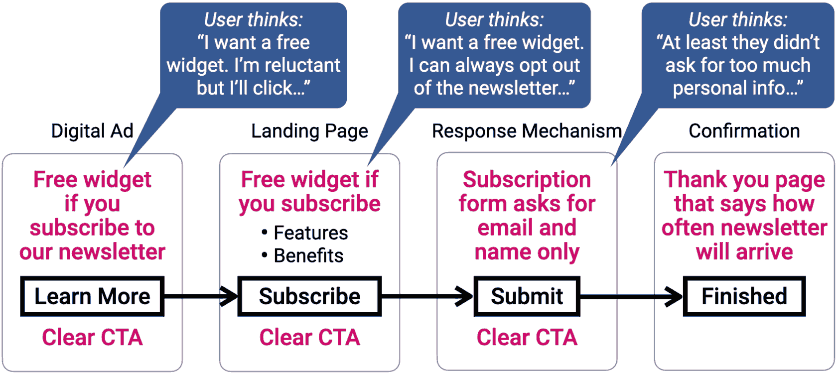
The ad copy should be paid off immediately and clearly on the landing page, like this:
How to apply this to make ads more effective
I strongly recommend that before beginning to create a digital ad, the copywriter and/or designer take a minute to diagram the user flow from the ad to the landing page to the conversion action.
I’m convinced that the simple step of diagraming the user flow will result in much more effective ads because it expands the context and forces the creative team to consider the entire user experience.
I believe that most ads will be more effective if specific, custom-designed landing pages are created to pay off the ad content. Don’t make users think to connect the dots because they won’t. In some cases, an existing page on the advertiser’s website might work as an ad landing page, as long as the page’s headline directly pays off the ad. Just remember that it may not be the homepage, it’s likely it will be another page within the site.